Brody Bikeservice evolved from a renowned e-bike manufacturer into a specialized bicycle service provider, offering reliable repair solutions for every bike and situation. The first location in Freiburg marks the beginning, with future expansion planned through partner workshops. The challenge: creating a website that clearly presents the services and streamlines the booking process for users.
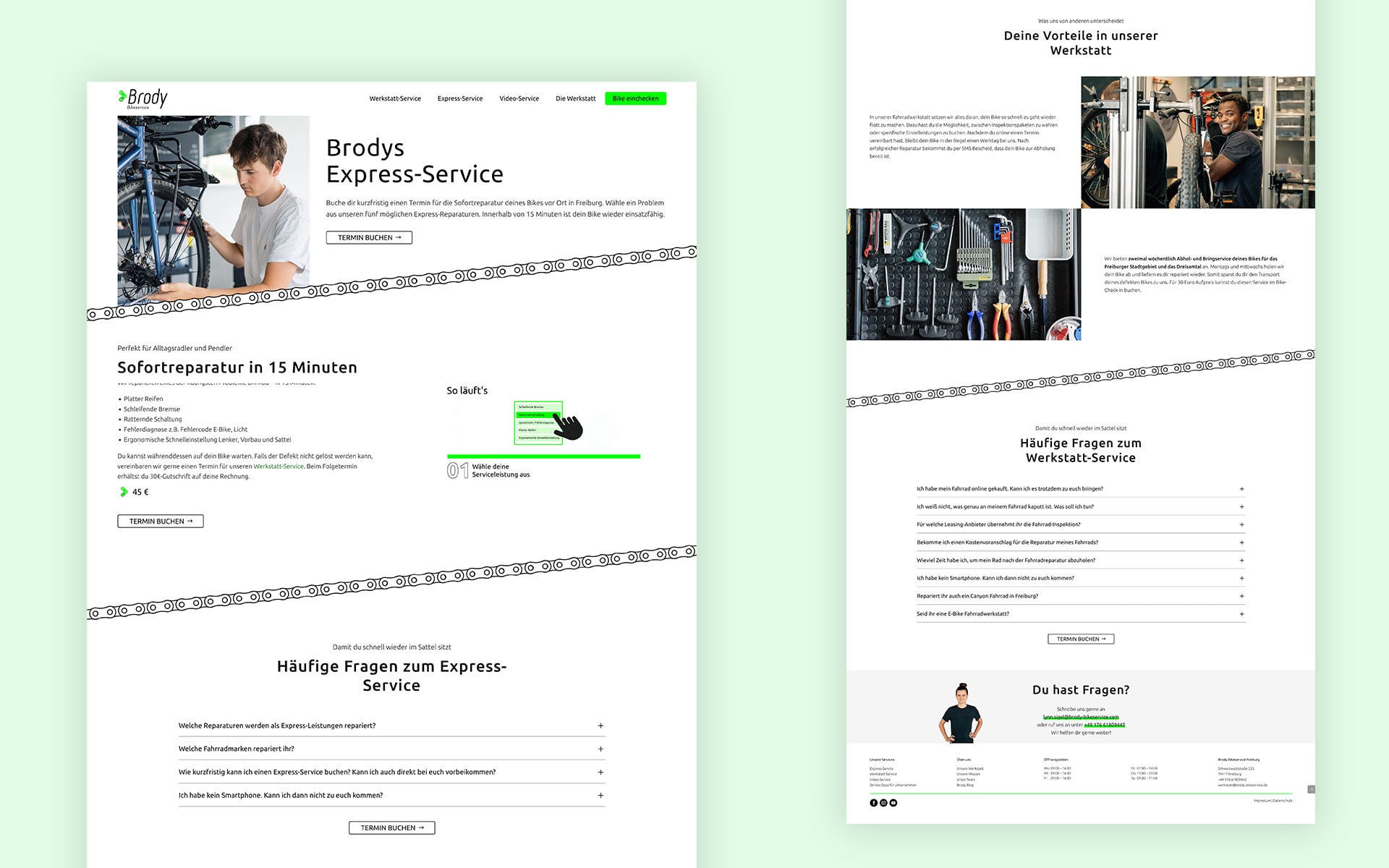
Brody Bikeservice provides a range of repair and maintenance services, but users may struggle to identify the right option. The challenge was to structure the service offerings in a way that feels intuitive—ensuring that both first-time visitors and returning customers can quickly find and book the service they need without hesitation. How do we guide decision-making seamlessly while keeping the path to booking effortless?
In a brainstorming session, we explored initial ideas and defined key challenges. This was followed by competitor and target audience research to understand market positioning and user needs. Based on these insights, we developed an information architecture that structured content intuitively.
Wireframes were created to establish the layout and functionality, while the brand identity was designed to reflect Brody’s dynamic and modern character. With the foundation in place, we moved into UI design, refining visual elements for clarity and engagement. Finally, a clickable prototype was developed for testing, ensuring the design was both user-friendly and conversion-focused before launch.
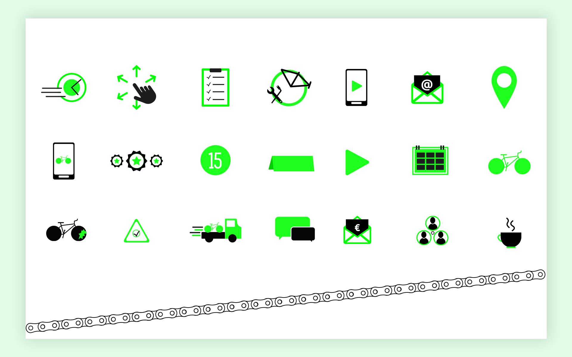
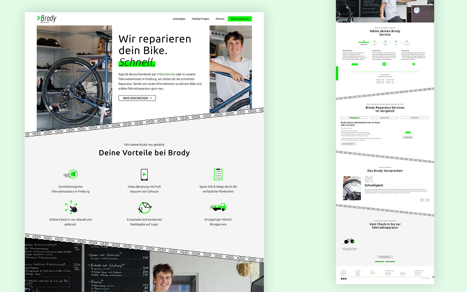
The UI design for Brody Bikeservice was developed iteratively, incorporating user feedback in the first months to refine usability and brand perception. The italicized logo and key visuals, including bicycle chain links, reinforced Brody’s identity as a fast and reliable service. A modern yet approachable aesthetic was achieved using the Ubuntu font, clean layouts, and intuitive navigation.
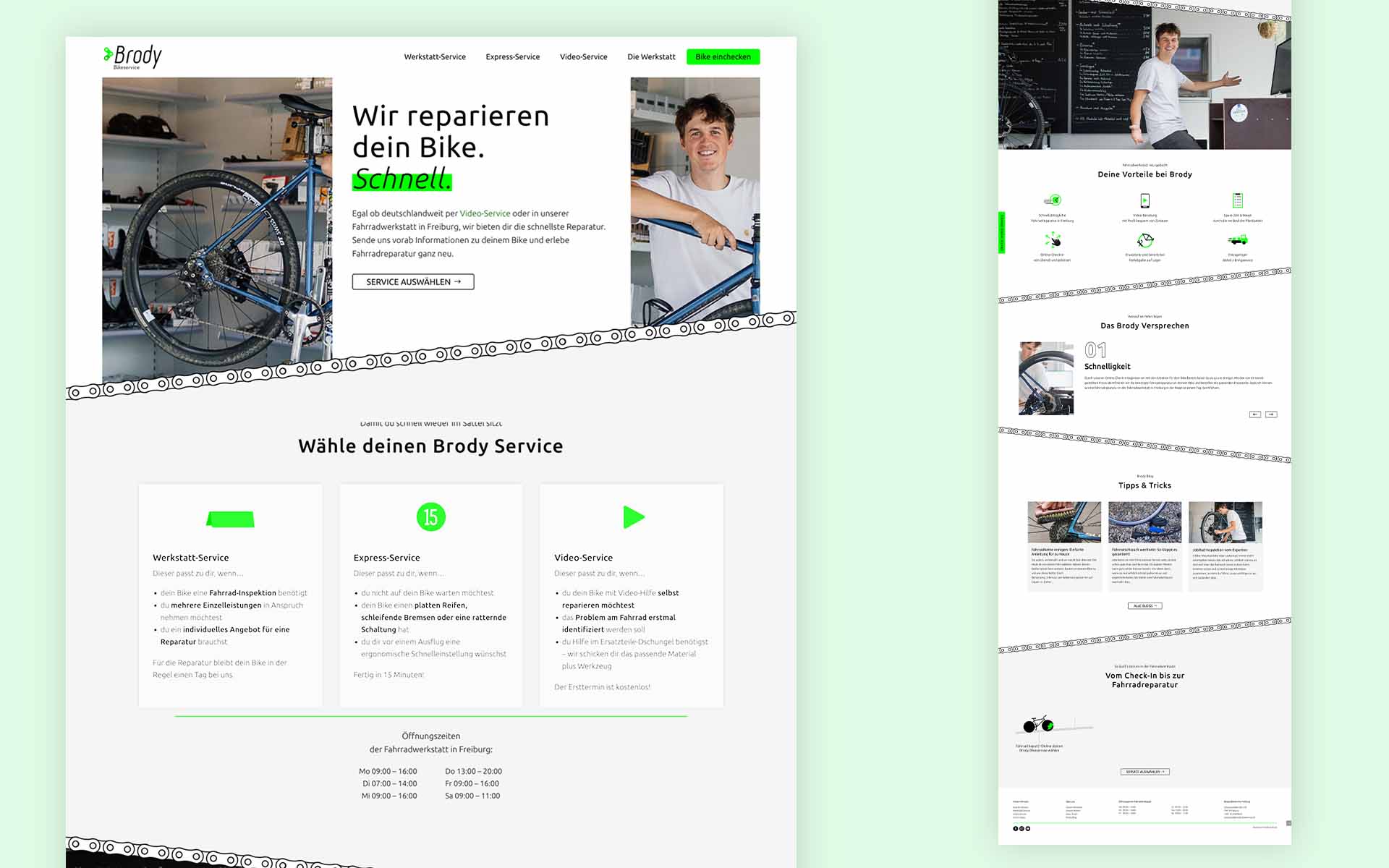
A key focus was the seamless integration of the booking iFrame, ensuring quick and easy access. To enhance clarity, services were given dedicated pages, later restructured based on user interaction insights. Wording was simplified for better comprehension, and motion graphics were implemented to visually guide users through processes. Regular testing and refinement ensured a smooth, conversion-driven experience across all touchpoints.
Brand, UX & UI Designer
User Research, Interaction, Wireframing, Visual design, Prototyping & Testing, WordPress Development
Nikolas Klauser: SEO, performance optimization, WordPress Development
Lynn Siegel Product Management, Photography, Copywriting
Markus Bauer: Strategic decisions
June-August 2022 | January-February 2023

1st iteration
2nd iteration
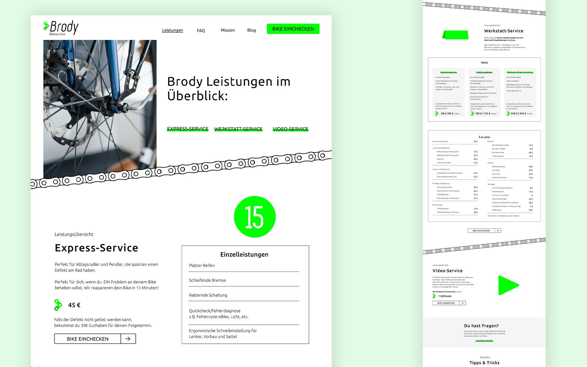
User feedback showed that services were hard to access and unclear in terms of suitability.
As a result, we simplified the offerings, removing unnecessary options and streamlining key services for easier navigation. This made services more accessible and helped users quickly find the right option.
As a result, we simplified the offerings, removing unnecessary options and streamlining key services for easier navigation. This made services more accessible and helped users quickly find the right option.
As a newly established brand, Brody Bikeservice required continuous refinement based on user insights. Early testing revealed the importance of clear hierarchy and precise wording to guide diverse user groups effectively. Motion graphics proved valuable in explaining services visually, enhancing comprehension and engagement.
Navigation labeling played a crucial role in user guidance, reinforcing the need for intuitive and accessible structures. The iterative approach highlighted that usability optimization is an ongoing process, ensuring the site evolves with user needs. These learnings will inform future projects, emphasizing clarity, accessibility, and seamless interaction.

