LADE, ein Startup mit einem erfahrenen Team, bietet umfassende Lösungen und Infrastruktur zur effizienten Aufladung von Elektrofahrzeugen. Das Unternehmen richtet sich an B2B-Kunden wie Unternehmen, Parkbetreiber und Gemeinden. Mit einer anfänglichen Produktpalette, die noch nicht in Produktion war, ist LADE kontinuierlich gewachsen und hat sich weiterentwickelt. Das Unternehmen legt großen Wert auf Innovation und arbeitet ständig an der Weiterentwicklung von Features, um den sich verändernden Bedürfnissen der Kunden gerecht zu werden.
Das Hauptziel des Projekts bestand darin, eine Webseite zu erstellen, die nicht überladen ist mit Informationen und emotionslosen Standardbildern, während sie gleichzeitig ein sehr abstraktes Thema erklärt und ein noch nicht fertiges Produkt anbietet. Im Zentrum stand die Entwicklung eines Designsystems und die dazugehörige Bildwelt, die leicht verständlich sind und den Eindruck von technischer Professionalität, hochwertigem Design und nachhaltigen Werten vermitteln können.
Brand Developer, UX & UI Designer, Visual & Motion Designer, Design- und Entwicklungsteam im Auftrag der Digitalgenossen
Adobe Creative Suite, Lucidchart, Sketch, WordPress & Elementor
Juli-Oktober 2021
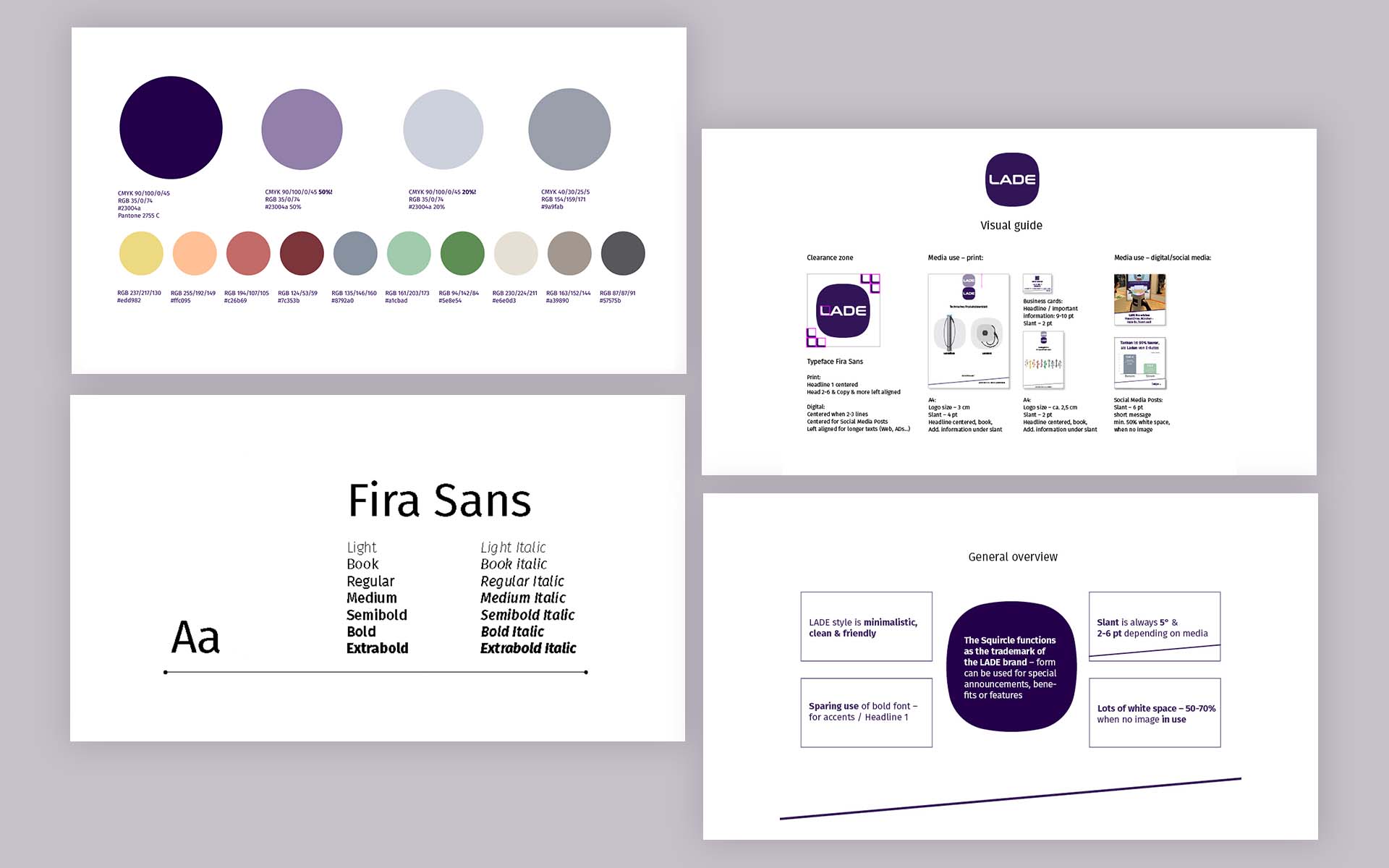
Bei der Entwicklung des Logos und der Marke für LADE wurden folgende Aspekte berücksichtigt: Das Logo basiert auf einer Draufsicht einer Ladesäule und formt die Form eines „Squircle“, einer Kombination aus einem Quadrat und einem Kreis, das zum wichtigsten Keyvisual von LADE wurde.
Die Farbwahl besteht aus einem technisch angehauchten Blau mit einem Lilastich, um Individualität zu vermitteln. Das Design und die Inhalte der Marke sollen vor allem einfach sein, was angesichts des komplexen Themas eine Herausforderung darstellt. Dennoch wurde darauf geachtet, eine klare und verständliche Darstellung zu schaffen, woraus sich das Stilelement der Schrägen entwickelte.
Die Farbpalette für die Illustrationen wurde von den ersten 10 Ladesäulenmodellen abgeleitet, um die Verbindung zur Ursprungsidee herzustellen und die Innovationskraft von LADE zu betonen.
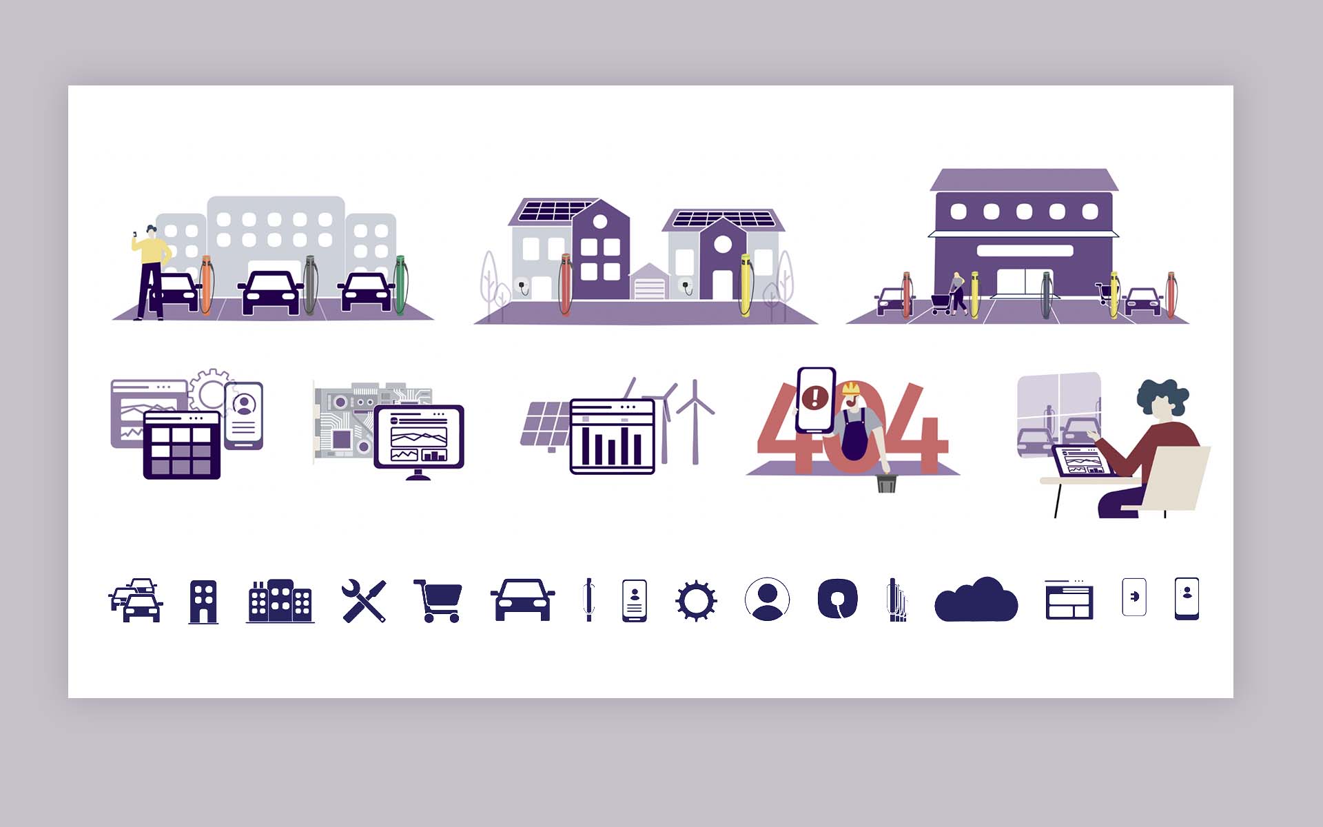
Da es weder vorhandene Fotos gab noch Stockfotos für alle Use Cases geeignet waren, entstand die Idee einer eigenen LADE Illustrationswelt.
Die Primärfarben der Illustrationen orientieren sich an der Logofarbe, während für komplexere Illustrationen und Infografiken auch Sekundärfarben genutzt wurden.
Die Gestaltung der Illustrationswelt orientiert sich ebenfalls an den Formen der ersten Ladesäule und verwendet abgerundete Ecken, um einen freundlichen und modernen Eindruck zu vermitteln.
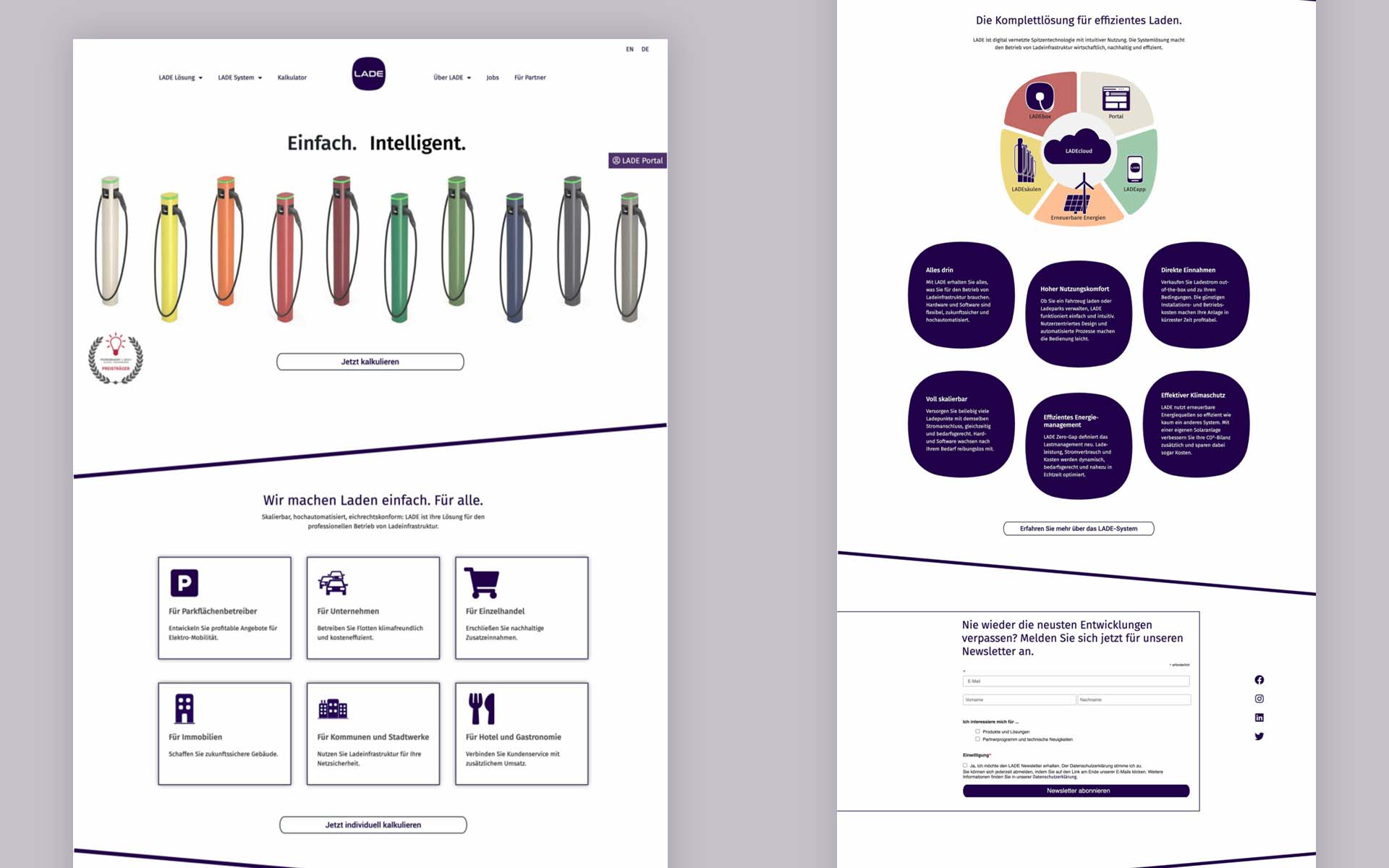
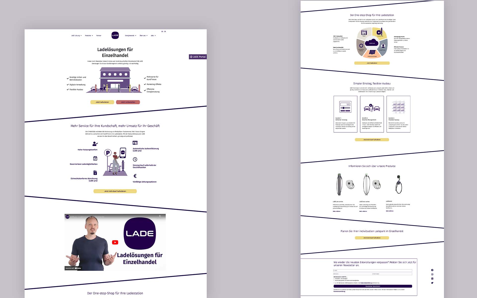
In enger Zusammenarbeit mit LADE wurde die Navigationsstruktur mehrmals überarbeitet, um sicherzustellen, dass die verschiedenen Zielgruppen für die Ladelösungen angemessen berücksichtigt und auf der Website entsprechend priorisiert werden.
Die Gestaltung der Website wurde bewusst einfach gehalten, wobei der Fokus auf den Inhalten lag. Ein hoher Weißanteil wurde dabei als relevant erachtet, um eine klare und übersichtliche Darstellung zu gewährleisten.
Die Inhalte und Strukturierung der Website wurden vor allem mithilfe von Lucidchart abgestimmt, während die eigentliche UI-Designentwicklung in Sketch erfolgte.
Die Umsetzung der Website erfolgte schließlich mit WordPress Elementor. Dies ermöglichte eine effiziente Umsetzung des UI-Designs gemäß den festgelegten Vorgaben und Anforderungen.
Das Projekt mit LADE, bei dem ich das komplette Websiteprojekt umsetzen durfte, war eine spannende Erfahrung. Es war faszinierend, das Projekt praktisch von Grund auf zu begleiten und das Wachstum von LADE zu beobachten.
Besonders hat mir die Entwicklung des Illustrationssets und des Designsystems für ein so wichtiges Thema großen Spaß gemacht. Es gab viel Raum für Kreativität, aber gleichzeitig waren die abstrakten Aspekte der Thematik auch herausfordernd.
Insgesamt war es eine bereichernde Lernerfahrung, bei der ich nicht nur meine technischen Fähigkeiten im Webdesign weiterentwickeln konnte, sondern auch die Bedeutung von Nachhaltigkeit und Innovation im Bereich der Elektromobilität besser verstanden habe.