Hinter Fliesenartig steckt ein junger, empathischer und unkonventioneller Fliesenlegerbetrieb. Die Markenidentität soll diese Haltung sowohl in der Visualität als auch in der Ansprache widerspiegeln. Die Website fokussiert sich in erster Linie aufs Recruiting und das Arbeitsumfeld und in zweiter Linie auf Kundengewinnung.
Ziel
Zunächst soll ein einheitliches Corporate Design als Basis entwickelt werden, um sich als professionellen Betrieb zu präsentieren. Die Website, eine Landing Page und Social Media Kampagne zielen dann darauf ab, konkret Talente in Fliesenlegerbetrieben anzusprechen, die zu Fliesenartig wechseln wollen.
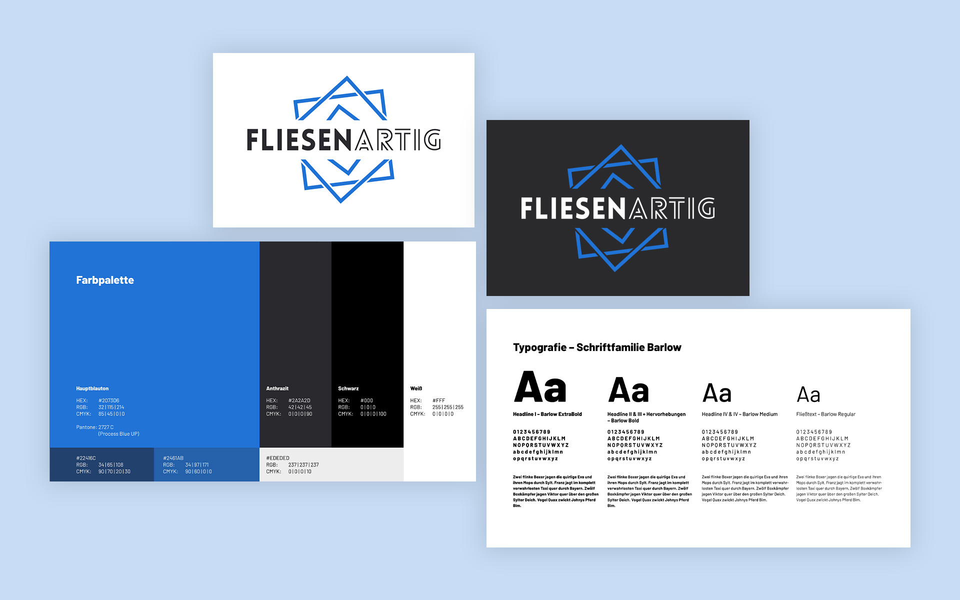
Gegeben war der Name und der Wunsch ein sattes Blau im Branding aufzunehmen.
Entstanden ist ein geometrisches Branding mit einem charakteristischen Fliesenvisual und vielfältigen Formen, die für die Vielschichtigkeit des Unternehmens sowie Möglichkeiten des Fliesenhandswerks stehen. Die Bildmarke ist ein wiederkehrendes Key Visual, das sich als repräsentatives Element auf allen Werbemitteln findet.
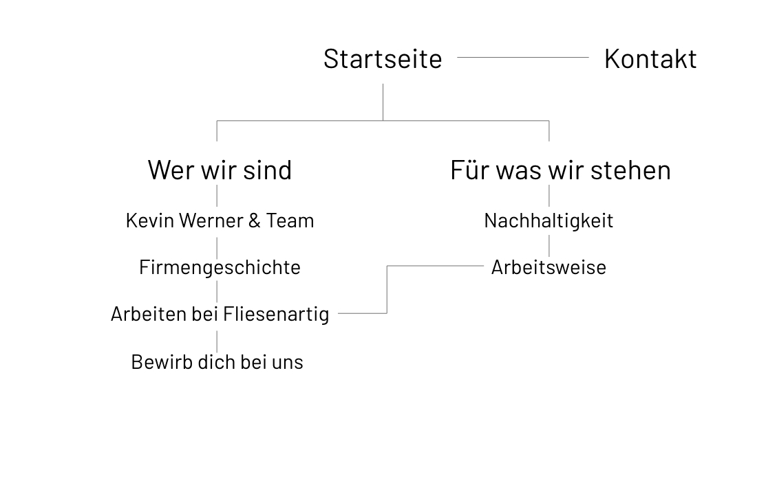
Navigationsstruktur I
Navigationsstruktur II
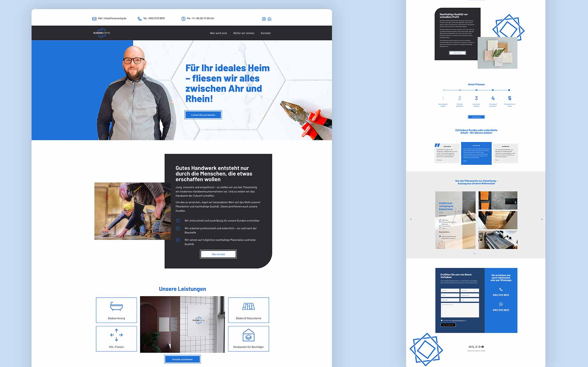
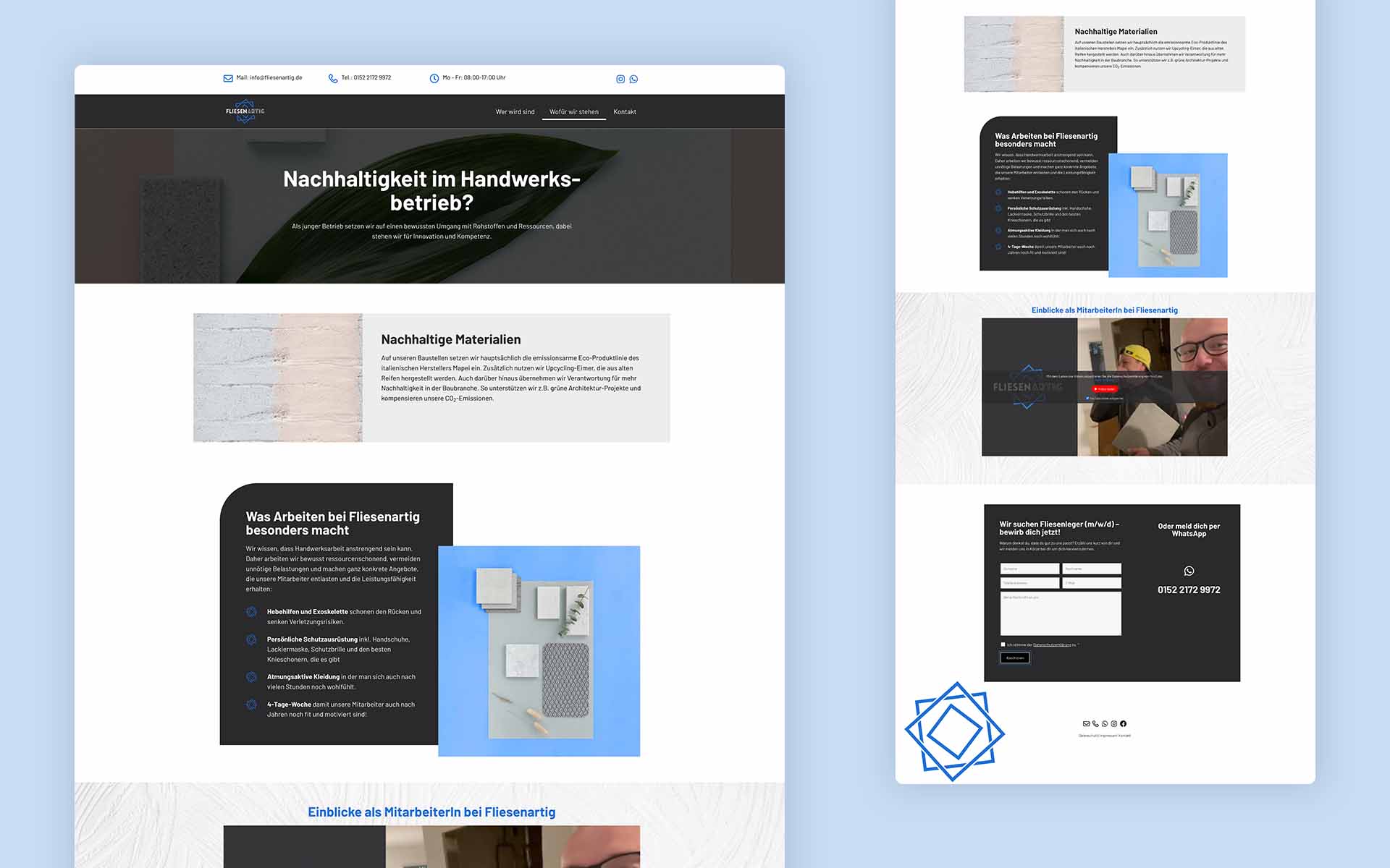
UI Design
Während sich Navigationsstruktur I an klassischen KMU-Websites orientiert, geht die zweite mehr auf die Menschen hinter dem Betrieb und deren Werte ein, was dem Gründer besonders wichtig war und in die Website übernommen wurde.
Das Logo bringt eine Verspieltheit mit sich, jedoch ist die Farbengebung und Schrift klar und minimalistisch. Diese Kombo ist genau das, was den Gründer und die Werte des Betriebs ausmachen.
Für die Website wurde diese Kombo ebenfalls eingesetzt, auf der einen Seite klar, mit viel Weißraum und der CI-Farbe im Fokus, auf der anderen Seite mit verspielten Formen, die immer mit der Fliese als Element in Verbindung stehen.
Die Texterstellung übernahmen die Digitalgenossen. Im Mittelpunkt stand eine persönliche und direkte Ansprache zu finden und gleichzeitig die Wichtigkeit der Werte für Nachhaltigkeit zu vermitteln.
Landing Page & Social Media ADs
Während Kunden gesiezt werden, ist die Ansprache für potentielle Talente lockerer, der Ton freundschaftlich und natürlich per Du. Die Kollegen verbringen viel Zeit miteinander, dabei ist ein respektvolles Miteinander genauso wichtig wie Spaß bei der Arbeit – das soll auch in den ADs und der Landing Page zum Ausdruck gebracht werden.
Um diese Website für dich optimal zu gestalten und fortlaufend verbessern zu können, verwenden wir Cookies. (Yummy!) Du akzeptierst die Cookies, wenn du diese durch den Klick auf den Button 'Akzeptieren' einwilligst.
AkzeptierenAblehnenDatenschutzerklärung