Vom renommierten E-Bike-Hersteller zum spezialisierten Fahrradservice – Brody steht für Servicebereitschaft und Reparaturmöglichkeiten für jedes Fahrrad und jeden Fall. Brody Bikeservice bietet unterschiedliche Services an, die in einer Website verständlich aufgezeigt werden sollen.
Freiburg geht dabei als erster Standort hervor, wo Brody Bikeservice zuhause ist. Später folgen Partnerwerkstätten, damit Nutzer und Nutzerinnen aus mehreren Standorten wählen können.
Ziel
Entstehung einer modernen, minimalistischen Website, die durch von einer klaren Markenidentität geprägt ist. Die Marke soll Schnelligkeit, Transparenz und Flexibilität vermitteln und dabei jung und professionell wirken.
Die Buchung der Services erfolgt durch ein externes iFrame einer Schweizer Agentur.
Rolle
Brand Developer, UX & UI Designer, Visual & Motion Designer, Design- und Entwicklungsteam mit Nikolas Klauser
Tools
Adobe Creative Suite, Miro, Figma, WordPress & Divi
Das Farbschema und der Name wurden von Brody selbst festgelegt, um eine klare Identität zu schaffen. Das Logo, kursiv gestaltet, symbolisiert den schnellen und effizienten Service, während der Zusatz „Bikeservice“ die Kernkompetenz verdeutlicht. Als Key Visual dienen zwei Fahrradkettenglieder, die auch unabhängig vom Logo eingesetzt werden. Mit der modernen Schriftart Ubuntu strahlt Brody Professionalität, Fortschrittlichkeit und Technologieaffinität aus. Die emotionale Komponente wird vor allem in der Kommunikation und den Fotos zum Ausdruck gebracht, um eine starke Bindung zu den Kunden aufzubauen.
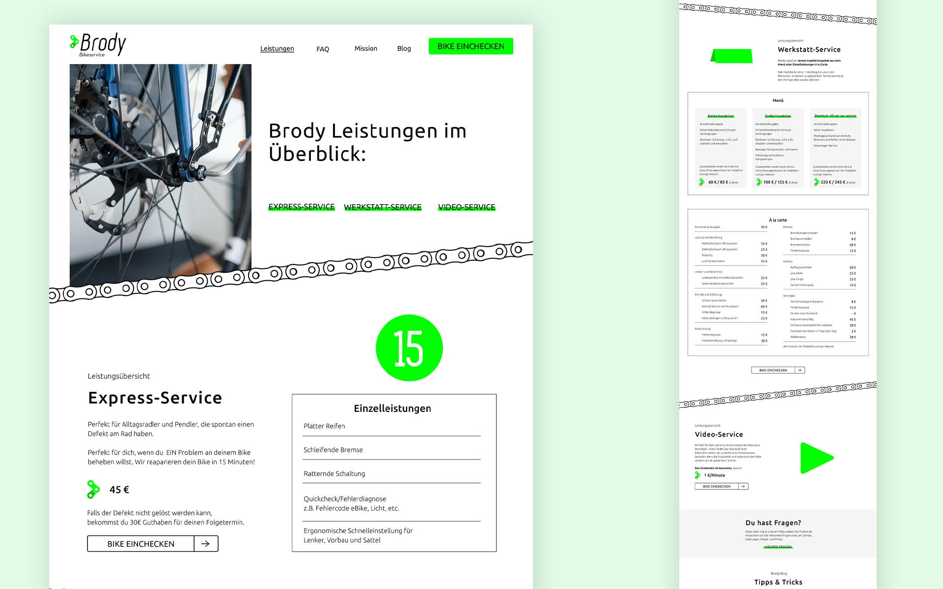
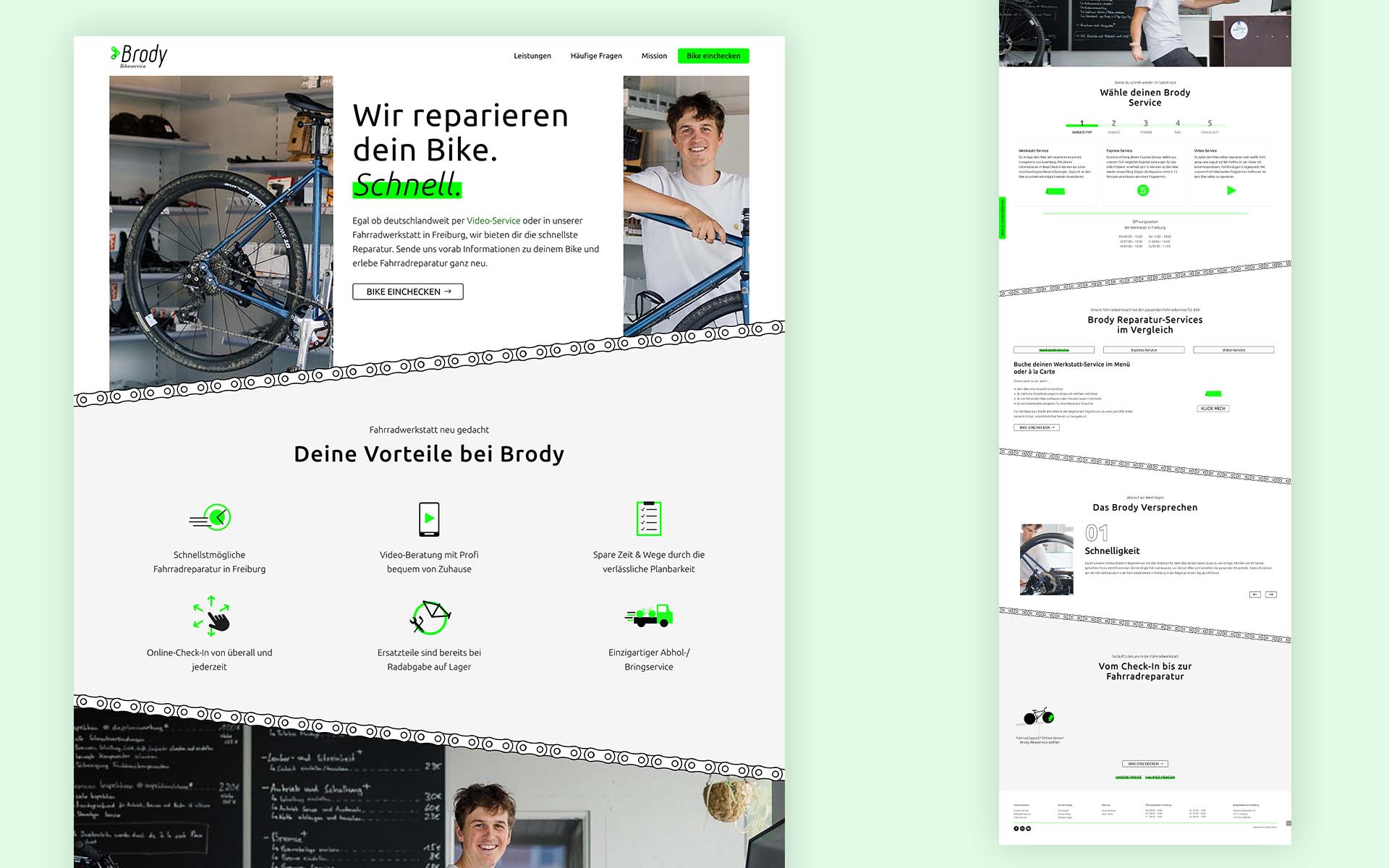
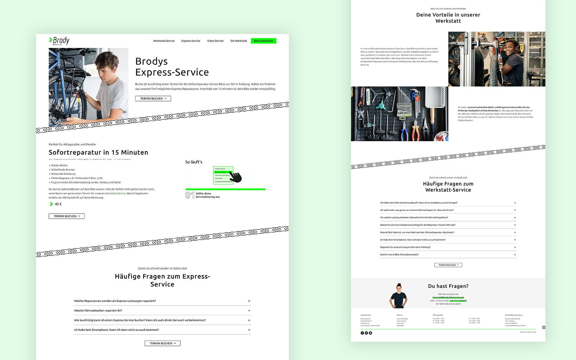
Oben: Figma UI Design zur Leistungsübersicht Unten: Erstes Homepage UI Design zur Umsetzung (Stand: Juli 2022)
Anpassung der Informationsarchitektur, Umstrukturierung der Inhalte & Priorisierung aufgrund User Umfragen und Tests (Stand: Februar 2023)
UI Design
Das UI-Design des Brody Bikeservice wurde in enger Zusammenarbeit mit regelmäßigen Absprachen und der Verwendung von Figma entwickelt. Besonderes Augenmerk lag auf dem iFrame für die Buchung, das einfach und schnell erreichbar sein sollte.
Um die Unterschiede der drei Services (Werkstatt-Services, Video-Service und Express-Service) leicht verständlich zu machen, erhielt jeder Service eine eigene Unterseite, die erst nach dem Launch im Optimierungsprozess umstrukturiert wurden. Die Inhalte wurden entsprechend aufgeteilt und FAQs individuell auf den jeweiligen Service angepasst.
Zusätzlich wurden informative Seiten wie „Über uns“ und „Blog“ in den Footer verschoben, um den Blick auf das Wesentliche zu lenken, aber dennoch den Zugang zu wichtigen Informationen zu ermöglichen.
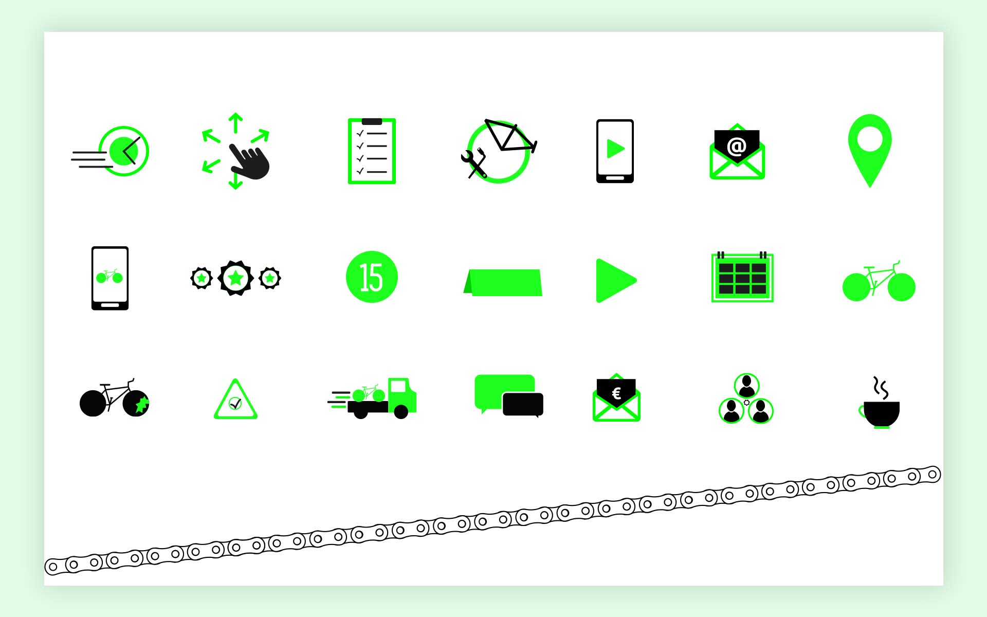
Icon Design & Motion Graphics
Die Umsetzung der Icons und Motion Graphics für Brody Bikeservice erfolgte im Einklang mit der Corporate Identity, um die Vorteile und Services ansprechend zu vermitteln und die Benutzererfahrung zu verbessern.
Insgesamt entstanden vier Motion Graphics, eine für den allgemeinen Ablauf und jeweils eine für jeden Service, um die Vorgehensweise anschaulich zu erklären. Dabei wurden Desktop- und Mobilversionen der Animationen entwickelt, um eine optimale Darstellung auf verschiedenen Geräten zu gewährleisten.
Learnings
Die wichtigste Erkenntnis war die, dass es sich um einen dauerhaften Prozess handelt, der immer Raum für Optimierungen lässt. Dabei ist es wichtig, die einfache Handhabung und eine angenehme Benutzererfahrung stets im Fokus zu behalten. Ein weiterer wichtiger Aspekt ist die sorgfältige Benennung der Navigation, da sie einen wesentlichen Einfluss auf die Nutzerführung hat. Diese Verbesserungen werden selbstverständlich auch in weitete zukünftige Projekte mitgenommen.
Um diese Website für dich optimal zu gestalten und fortlaufend verbessern zu können, verwenden wir Cookies. (Yummy!) Du akzeptierst die Cookies, wenn du diese durch den Klick auf den Button 'Akzeptieren' einwilligst.
AkzeptierenAblehnenDatenschutzerklärung